After our C.R.A.P lecture we were asked to edit a website that had all the bad features of C.R.A.P and turn it into a functional, and exciting one. The image below represents the website i chose. It is a website for 'Blues Ski Shop' who sell ski equipment and clothing and provide useful links to ski information.

The reasons for picking this and categorising it under C.R.A.P are....
Contrast: First of all the colour scheme of the website is awful, its dull and boring and everything is pretty much the same blue, there is now big colour clashes to draw you to it. There is large and small type in the main page. The text is your standard base font, nothing exciting or edgy. The icons that take you round the site are surrounded by big and small lines. The random box at the bottom uses warm colours for the text on a warm background completely drowning it out. The images are compressed and therefore look really un-professional. Lastly the graphics of the whole site are very dated.
Repitition: There is repitition as the home page holds information that you would find on other pages of the site.
Alignment: On the main page and others there is no alignment whatsoever, everything is just scattered across the page.
Proximity: Again due to the alignment, the whole proximity is off creating a very confusing site and a lack of group related items being together.
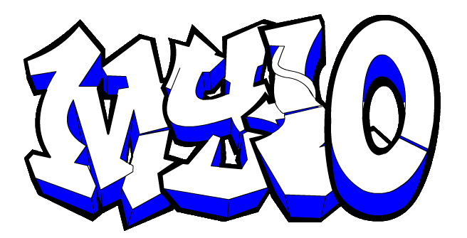
Here is my newly designed website for Blues Ski Shop....

Improvements....
Contrast: I changed the colour scheme to a deep hard hitting royal blue that contrasts highly to the black making it edgy and more modern, this is heightened also by the sort of street white spray can effect. I created better graphics, the title is more up to date and the fonts of the page are more exciting and the same size. The icons now all fit equally into exact sized skis that i made more dense for the writing to stand out. I created images that aren't compressed to look more professional. The main thing was that i tidied all the confusing writing into the icons and created a simple working site and that the graphics of the site were more up to date and extremely appealing.
Repetition: I fixed the repetition by erasing all the unnecessary writing from the main page, leaving it in its separate pages.
Alignment: I fixed the alignment by creating a symmetrical site and placing the un-aligned writing in their actual pages under the icons (the skis).
Proximity: The site now looks like a professional site, rather than a messy splatter of all sorts of different words and graphics.
All in all the big change was re-vamping the site as it was very dated. I changed it to a professional, modern, more appealing site to the skiers of today. Something you'd go on and want to use not fall asleep at the computer, or move away from.
No comments:
Post a Comment